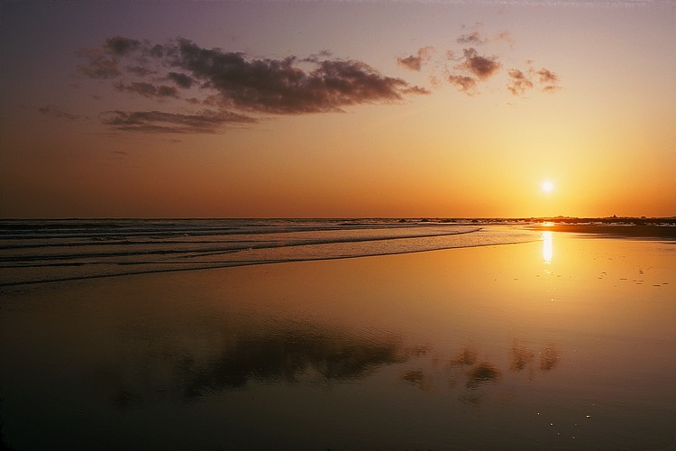
Ocean Clouds Reflection at Sunset, NW Olympic Peninsula Coast.
Kodachrome 25 exposure.
Kodak's Kodachrome color reversal ("slide") film was available in sheet film sizes from its introduction in 1935 until about 1953, when it was superceded by Ektachrome. It continued for another 50+ years in smaller, roll film sizes, where it achieved legendary status for its color rendition.
Early in the history of the science of color photography there was a recognized contradiction between two different approaches to the exact properties of the spectral sensitivies of blue, green, and red color separation channels, whether in color films or when making direct color separations with three exposures on black-and-white film through color filters.
On the one hand, the very term "separation" implies the channels need to be well-separated and non-overlapping in wavelength. For example, we wouldn't want green light to effect (contaminate) the blue-sensitive channel. This sets constraints on how broad in wavelength the spectral sensitivity channels can be. They need to be wide enough to have sufficient speed (sensitivity) and also adequately cover about a third of the visual spectrum, but not so wide that they extend appreciably into the neighboring third.
Commercially available color films all follow this principle, Kodak's Ektachrome 64 Pro -- the sheet film variety from about the mid-1970s, known by its emulsion number #6117 -- well illustrating this:
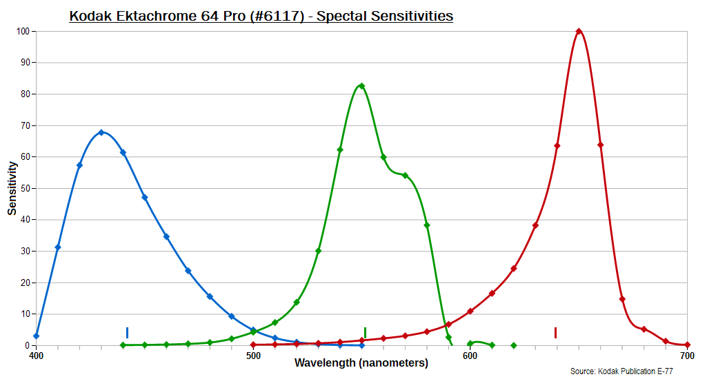
The curves have been scaled to yield the same area under each.
The tick marks at bottom show the mean wavelengths.
(The green curve appearing to go below zero is an artifact of the
smoothing mathematics.)
I note in passing an unavoidable aspect of this type of approach,
namely that there are two relatively dead spots in the spectrum, on
either side of the central green spectral sensitivity, where neither
it nor the adjacent channel has very much response to those particular
wavelengths. For the Ektachrome example above the two cross-over
zones are at roughly 480-520 nm and 585-610 nm. You can see these
in pictures of natural rainbows, as they create visible, dark
artifacts. Most things being photographed consist of light covering
a large part of the spectrum, and so are not much effected by this
limitation in the film's sensitivity, but spectrum (monochromatic)
colors and objects that are only bright at these wavelengths can be
poorly rendered depending on where they fall relative to the peaks
and valleys.
Another unavoidable result is that color films are slower in speed
than B&W films, all else being equal, because the former have
parts of the spectrum to which they are not (very) sensitive.
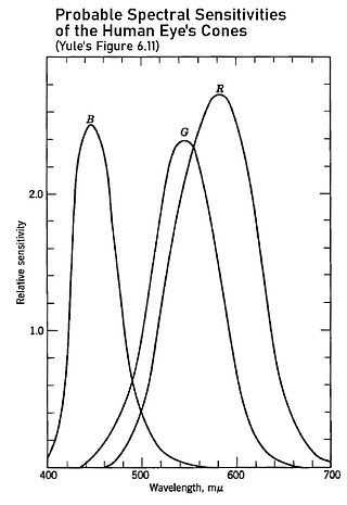
Okay, back to the task at hand... It was known by about the 1920s that the spectral sensitivities of the eye's cones were broad and overlapping, especially the green- and red-sensitive cones, as shown in the figure at right. Thus, for a color film to see colors the way the eye does suggests the channel spectral sensitivities need to similarly be broad and overlapping to some extent, in contradiction to the first requirement discussed. Such sensitivities would have greater accuracy relative to the way the eye sees color but a lower "color separation efficiency".
In the 1967 book Principles of Color Reproduction, author J.A.C. Yule describes a mathematical technique developed in the previous decade (or two) for determining something called the colorimetric quality factor, denoted "q", which gives a measure from 0.0 to 1.0 of how closely a given color separation channel corresponds to a linear combination of the eye's three different color sensitivities. This is covered on pages 138-46.
A linear combination will have the mathematical form
C(λ) = a1×K1(λ) +
a2×K2(λ) +
a3×K3(λ),
where C(λ) is the linear combination of the three K's (B, G, and
R in the diagram), and almost always
a1 + a2 + a3 = 1.0 .
An example is then given and worked out in complete detail in Appendix C, using Kodak Color Separation Film, Type 1, and a Kodak Wratten #47B filter. This combination of a black-and-white film and deep blue filter would have commonly been used back then in the printing and publishing industry for making direct color separation negatives from original artwork, along with exposures using the corresponding green and red filters. (Yule even includes the spectral transmission curve of a typical process lens, as an additional slightly yellow filter in the system, which would have typically been used back then in shops making direct separations from things like artwork. A process lens is basically like an enlarging lens used in reverse, to de-magnify rather than the opposite. The cement used to join pairs of elements of the lens internally would likely have been the cause of the yellowing, as back then it would yellow slightly over time; there was minimal effect on the results when B&W films were being exposed.) There were several sets of what were called "tri-color" filters for making direct color separations, or for color separating processed color slide films (Color Separation Film, Type 2, with a lower contrast, was used for this), with the #47B being probably the most predominant deep blue filter in these sets. There were several slightly different choices available for the green and red filters, depending on the situation.
The net result of the example was that q in this case worked out to be ~½, which is somewhere between poor and mediocre. The mathematical process for determining q produces as a side benefit the closest color-mixture curve to the response being analyzed, that is, the nearest spectral response having an ideal colorimetric quality factor (i.e., q~1), which when plotted in the example worked out yields a filter with a peak/mean transmission wavelength closer to 460 nm rather than the 428 nm given by the #47B.
One naturally wonders how the spectral sensitivities of Kodachrome rate on the colorimetric quality factor scale, given its reputation for excellent color fidelity. To this end I've spreadsheeted Yule's example to reproduce his numbers, to make sure all the calculations are being done correctly, and then substituted Kodachrome's spectral sensitivities for his film+filter combination. I've specifically used the data for Kodachrome 25 film (Daylight) found in the Kodak Publication E-77 (1980 edition), pg DS-31, shown below. The plotted curves had to be digitized from hardcopy scans of the original to convert them into tables of numbers for the spreadsheet calculations, all of which I believe I did correctly. The Ektachrome curves shown above were derived in exactly the same way.
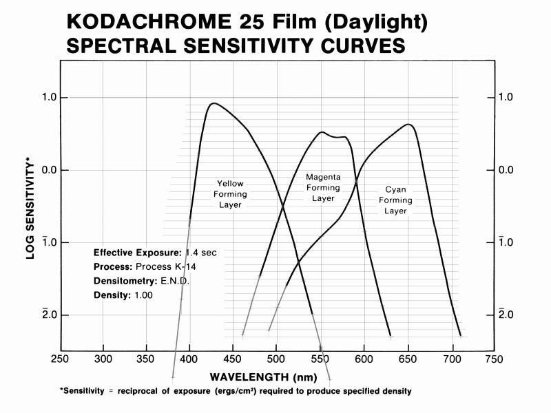
Note that the vertical sensitivity scale is logarithmic in this
case.
The mean wavelengths of the three Kodachrome 25 spectral sensitivity channels are 444.3 nm, 554.8 nm, and 632.0 nm. The ~445 nm value for the B channel, almost the same as for Ektachrome 64 Pro (442 nm), suggests Kodachrome may have somewhat the same issues with the mean wavelength of this channel being slightly too low, as with Yule's example, though maybe only to about half the extent.
Well, I know anyone reading this expects a drum roll and the crucial numbers at this point, but first a caveat or two. Even if all three color separation channels at the front end of a color reproduction system have high colorimetric quality factors -- like 0.85 to 0.90, or above -- this does not guarantee great results. For one thing, the linear combinations of the three human cone sensitivities can be different for each of the three channels. So there is essentially a 3x3 matrix of coefficients involved.
In addition, the dyes or inks (or screen phosphors) used to actually make the reproduction being viewed definitely effect the results, so there is more to it than just having high colorimetric quality factors at the color separation stage. Kodachrome's cyan dye, in particular, which gave slides projected in a darkened room such vivid, almost surreal, green foilage and blue skies, made it somewhat incompatable with color enlarging papers as early as the 1970s (like Ektachrome 1993 and 2003) and other materials designed for use with the dye set of E-6 process films (Ektachrome, Agfachrome, Fujichrome, etc). These problems continued into the scanner era, with their sensor channel sensitivities similarly being optimized for use with E-6 films. The result is that greens and blues in Kodachromes tend to print too dark, and with noticeable hue changes, particularly with bright and/or saturated greens. Having near-perfect color separation sensitivities from a colorimetric point of view would not change these problems caused by Kodachrome's cyan dye.
So now we're ready for the drum roll, right? Not quite. In the calculation of the colorimetric quality factor there are two illuminants involved. One is the light source used when making the color separation in question, the other is that used to view the final reproduction at the end of the process. In Yule's example, the first is a white flame arc; something like a carbon-arc light source would have commonly been used in commercial printing, as it was bright (fast) and put out more blue light than any other artificial light source. The second illuminant he takes to be a 3800°K color temperature continuum source, which would have been typical of a very high temperature filament bulb, at the upper end in brightness and color temperature of what was available back then. Some years later, with fluorescent tube phosphors having been developed that had better (higher) color rendition indices (meaning they put out more light across all parts of the spectrum, especially the red and to some extent also the blue), somewhat higher color temperature viewing illuminants (like 4500°K) became the industry standard.
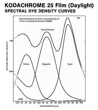
For the calculation for Kodachrome the choice of the two illuminants to use is simple. The film is considered a "daylight" film, and photographic daylight is taken to have a color temperature of 5500°K, so I used the CIE D55 standard illuminant. Even though it is a purely synthetic (artificial) construct that doesn't appear anywhere in nature, D55 is close enough to average daylight to be both suitable and widely used for purposes such as this. The viewing illuminant is simply a 3200°K color temperature continuum, typical of slide projector bulbs where the filament is at about this temperature. This is the number specified in the spectral dye densities graph at right above.
Okay, so with a quick drum roll, the q value for the
Blue channel of K-25
Daylight Kodachrome calculates out as
0.803, which is pretty good
if not perfect. I left any lens out of the calculation. With
the supplanting of most B&W photography by color films
in the 1960s, coated and multi-coated camera lenses had very
little if any color cast.
The number for the Green
channel is an impressive 0.867 .
For the Red channel, however,
the value I determine is a disappointing 0.475 . This is no doubt due to the spectral
sensitivity peaking at ~650 nm, whereas for the human eye
the peak is around 580 nm. In fact, the eye's red sensitivity
is already down below 20% of its maximum by 650 nm.
I've also run the numbers for the older (1931) standard illuminant CIE C in place of the D55 illuminant. CIE C has a color temperature approximately 1275°K higher than the 5500°K of D55, and thus might be more relevant to my own usage of Kodachrome 25, which has been primarily at higher altitudes, roughly from 6,000 feet up to above 14,000 feet, where at least 20% less atmosphere overhead means less blue light has been scattered out of the sun's illumination before it reaches the ground. The G and R channel values are little affected by this change (to 0.859 and 0.469), while the B channel value for the colorimetric quality coeffecient is reduced more, to 0.756.
How precise are these numbers? It's impossible to say because Kodak didn't put error bars on their published curves. Following Yule I've given them to three places after the decimal, but my sense is that the last digit might not be all that significant. Someone with a different copy of Pub. E-77, digitizing the data curves on a different scanner, and re-determining the table of sensitivity values to use them in the calculations would likely come out with slightly different numbers than I did. But, again, by how much is impossible to say with any certainty.
Discussion
I would also re-emphasize that even if the film's qR value was up near that of the other two channels, this would still not guarantee accurate color reproduction across the spectrum. In formal language that would be a necessary but not sufficient condition, just by itself.
Without a complete modelling of the entire film's system from start to finish, including its three characteristic curves and the three spectral dye density curves, it's impossible to say anything quantitative about the exact effect of the low qR value on the film's ability to reproduce various colors accurately, with the dyes being the more important component. Qualitatively, one would expect the effect to extend down from the reddest red at least to colors with hues of the wavelength where the R and G spectral sensitivity curves cross, at 590 nm, and maybe 10-20 nm lower with decreasing effect; this is in the orange to yellow-orange part of the spectrum. For reference, the low-pressure sodium vapor lamps commonly used for streelights and parking lots has a wavelength of 589.3 nm.
Since I've never heard anyone complain that Kodachrome was horrible for shooting fall colors or sunset scenes, it might be that the errors were of the sort that people found acceptable or even desirable, like a slight shift in hue towards longer (redder) wavelengths or an exaggeration or increase in color saturation for these colors. The reproduction of flesh tones (of Caucasians) would be another important thing to look at, as most pictures are of people. It was well-known, from customer surveys and studies where subjects were shown slightly different hue offsets from an exactly accurate reproduction, that people preferred seeing slightly redder ("rosier") flesh tones in prints than were present in actuality in the people originally photographed. This was a small part of what went into the design of Ektachrome film, which is why it had a reputation for being better for portraiture and pictures of people in general than Kodachrome -- except that the effect turned out to be over-done for some darker-skinned people ("blacks"), leading to a series of complaints, accusations, and controversies.
The effect of a mediocre red channel q quality factor would not be restricted to just yellows, oranges, and reds. A simple example would be a clear blue sky, which emits less radiation at longer wavelengths than at shorter ones. The Kodachrome red channel, having a mean sensitivity wavelength longer than other films would thus record blue skies slightly darker, maybe by ¼ stop. The direct effect would thus be to increase slightly the amount of cyan dye deposited in areas of blue sky, since the effect of red light is to remove cyan dye. Thus there would be also be a slight hue shift in the direction of the hue of the cyan dye. This might not be a fault or error in and of itself, as it could also be a correction for mis-reproduction caused by the net effect of the other two channels' spectral sensitivities and their associated dyes.
I'd also emphasize that I'm not able to say anything about other films, even other varieties of Kodachrome, whether Process K-14 contemporaries of K-25 (like Kodachrome 64) or earlier editions using earlier versions of the development process, such as Kodachrome II and Kodachrome X. Since the latter two films were superceded by K-25 and K-64 in 1974, one might reasonably suppose the general type of work done by Yule (and others), and appearing in his book, had some influence in the design and making of the updated and improved Kodachromes. As I shot my first Kodachromes in 1970, on Kodachrome II, I can definitely say that Kodachrome 25 was a much better film. How much of this was due to the film and how much to the then new K-14 process hasn't been written up in detail by anyone involved so far as I know.
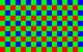
Similarly, I can't say anything about modern digital cameras. Unlike Kodak, the camera makers don't publish curves showing the spectral sensitivities of the blue-sensitive, green-sensitive, and red-sensitive pixels for their Bayer array sensors (the standard, shown at right), which have a tri-color color separation filter over each silicon pixel. Maybe the sensor makers themselves put this information out, but I haven't seen it; the net sensitivity for each channel would be that of the particular flavor of silicon used plus the filter transmission at each wavelength.
It's also not necessarily the case that a so-called RAW read-out from the camera (if available) gives the amount of light absorbed by each pixel in its color, as the on-board processing computer chip inside the camera can easily subtract (or add) from a pixel value some proportion of the numbers from one or both of the other color channels, using nearby pixels. That is, something like G = G0 − kgb×B0 − kgr×R0, where kgb and kgr are between zero and one (and generally smaller numbers), might be the green value in the RAW file for a given pixel. There would be similar equations for both B and R, with different constants. This could/would be done to increase the color separation efficiency, while almost certainly lowering the colorimetric quality factor. This is proprietary information with the camera makers, so there's no way to know exactly what's going on. With addition instead of subtraction this is how a monochrome (B&W) picture is output on cameras that can do this if the proper setting is selected.
In that sense Kodachrome was far superior to any digital camera output because it's possible to work out what it was doing with a given input.
Yule was in the Graphic Arts division of Kodak, which had an extensive product line for the printing industry, everything from newspapers to magazines to books, etc.
The chief distinction from regular photography is the use of inks rather than dyes or silver. Moreover, the inks are laid down with a uniform thickness, rather than a continuously varying amount, and their effect in any small part of the print is determined by the halftone dot size, or, more precisely, the dot area, since the light reflected from that spot is a mixture of light that has gone through the ink layer (twice) and light reflected off the paper surrounding the dot unaltered. Yule's expertise was in the evaluation of ink color.

©2023-26, Chris Wetherill. All rights reserved. Display of words or photos here does NOT constitute or imply permission to store, copy, republish, or redistribute my work in any manner for any purpose without expressed prior permission.
