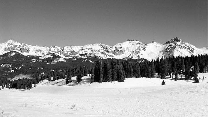
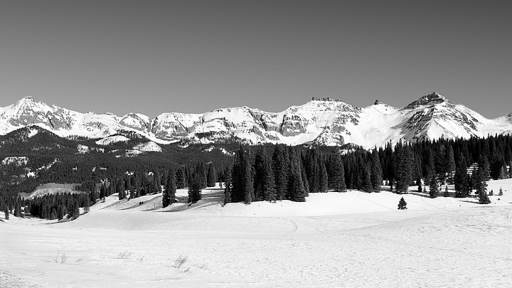
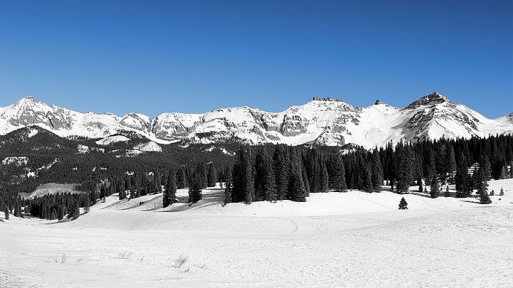
Sunny Day in January; Lizard Head Pass, San Juan Mountains, CO.
Wratten #9 (yellow) filter, Super-XX Pan film.
Perhaps one of the first thing many learn about B&W photography is that it's possible to darken blue skies by using colored filters over the lens at the time of exposure. Moreover, the effect is variable, increasing as one goes from yellow to orange to red filters.
But this is only qualitative, and the question naturally arises as to how much a given filter darkens the sky. For example, in the widely used Zone System (1 zone = 1 stop), is it a reduction of ½ zone for a regular yellow filter (say a Wratten #8, also sometimes known as a K2), or is it closer to a whole zone? For a red filter, is it 1 zone, or two?
I was somewhat surprised to find that there wasn't a standard reference where these values were tabulated. So I constructed one.
To do this I used a spreadsheet program to simulate the exposure of a somewhat randomly chosen panchromatic B&W film to daylight, with and without a series of long-pass filters ranging from hard-UV (very pale yellow) up to deep red. All these filters basically absorb wavelengths shorter than some value and transmit all longer wavelengths.
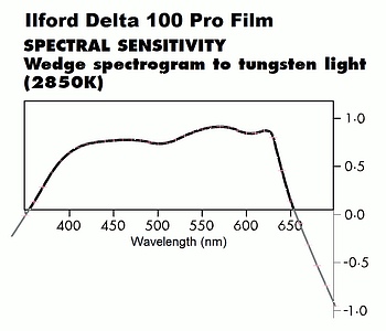
The film used for this experiment was Ilford Delta 100 Pro. Its datasheet conveniently had a spectral sensitivity spectrogram (at right), which was easily digitized at 10 nm intervals. This film is still being manfactured in sheet film sizes like 4"x5" (2018), so the results have current relevance. And it seems like a film which is not atypical for "pan" films generally; that is, it doesn't have "extended" red sensitivity, like Kodak's Tech Pan 2415 film. Still, it's difficult to say right off how the results would compare to those obtained with other commonly used pan films. One would expect any differences to appear at the margins, and to be more pronounced with deeper orange and red filters.
[An old spectral sensitivity curve I have for Super-XX Pan (#4142) film shows it having a slightly reduced red sensitivity, peaking at ~600 nm before falling off to higher wavelengths, compared to this last peak being at ~625 nm for Ilford Delta 100 Pro; this probably explains why it was especially recommended for studio and darkroom work (like making color separations from slides) where a tungsten lamp was commonly used to expose it -- with lots of long wavelength light, this would "cancel out" with the film's reduced sensitivity there, giving a response across the spectrum that was more level.]
For a daylight illuminant I chose the CIE standard D55 illuminant, which has a correlated color temperature of 5500°K, that being the color temperature of "photographic daylight". Even though the series of CIE Dnn illuminants are purely synthetic, and thus have no counterpart in nature, they are easily constructed (also at 10 nm intervals) and are designed to be representative of the types of daylight illumination photographers typically encounter in a wide variety of circumstances, being a mixture of sunlight and skylight. As with the choice of film, changing this to standard illuminant CIE C (with a correlated color temperature of 6775°K) or D65 would change things subtely but not substantially.
In order to define an "unfiltered" spectral sensitivity for baseline comparison purposes I added a standard UV filter to the system, since most photographers use these on their lenses at all times, even if just for protective purposes. The filter chosen was a B+W #415 since a) I had its spectral transmission curve, and b) because it is about as "hard" a UV absorber as you can get without getting into filters that a have a distinctive if slight pale yellow look to the eye, which means they absorb some light in the very most violet part of the visual spectrum. The #415 has a 50% absorption level right at 400 nm (whereas for the more common B+W UV 010 this wavelength is closer to 375 nm -- which means it passes some blacklight UV, the bright I line of mercury being at 365.4 nm). The closest Kodak Wratten filter to the #415 is probably the #2C, while the closest Tiffen filter is their Haze-1; both are slightly stronger filters than the #415, meaning their 50% transmission points are at longer wavelengths (~410 nm for the Haze-1).
For the main part of the experiment I used a series of seventeen Kodak Wratten filters, starting with a very pale yellow (#2E) and going in steps all the way up through the yellows and oranges to a very deep red (#92). The data for these is tabulated in Kodak Publication B-3; I have the 1973 edition. One of the seventeen consists of a combination of two filters -- a magenta (#32) plus a #16 (orange-yellow) to block the #32's blue passband, leaving the its red passband as the effective filter, which turns out to be intermediate between a #26 and a #29 (both deep red filters); any filter from about a #15 up to a #26 can be used as the second filter to give this passband with the #32.
In addition I also went in the other direction and ran the numbers for a series of sky lightening filters, which include mainly blue and bluish-green (cyan) filters, but also some deep blue and violet filters, as well as some green filters (and combos) which are meant to yield a spectral response more closely matching that of the eye.
The first step then was to "expose" the film through each filter directly to the D55 daylight illuminant, which yields the filter's filter factor. This effectively determines the amount the exposure would need to be increased to keep the exposure to a white (or neutral) card constant.
I then exposed the film+filter combos to a blue sky illuminant which was generated by an above-the-atmosphere (ATA) spectrum for sunlight I had (it comes from satellite data) being purely Rayleigh scattered according to a λ-4 function. This illuminant has coordinates of x=y=0.2348 in the standard CIE chromaticity diagram. It represents the deep, pure, "cobalt" blue skies one sees in deserts and at high altitudes, where there is neither moisture nor dust reducing the color saturation of the sky. It is thus an extreme example of a blue sky, but since I live at high altitude and in a very dry climate it's not irrelevant. It does yield maximum amounts of darkening (or lightening) for a given filter.
The diagram below shows the results, with the series of lightening and eye-matching filters on top and the darkening filters on the bottom:
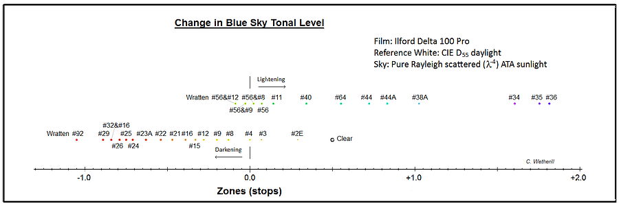
The point marked "Clear" uses the B+W #415 UV absorbing filter to
define the visual passband.
The first important result is that the filter which supposedly yields the correct blue sky tone rendering is not necessarily the traditionally recommended #8/K2 filter, but the next step weaker yellow filter, the #4. This has an effective mean wavelength (a quantity which also drops out of the calculations) of 561 nm with this film and white illuminant, while with the #8 it is up at 569½ nm. The CIE visual response curve peaks at 555 nm, and has a mean wavelength of 560.2 nm, so a #4 results in a better mean wavelength match than a #8. The #4 is thus somewhat arbitrarily chosen as the zero reference point for the series of blue sky darkening filters, the filter which least alters the tonal rendition of this synthetic sky relative to the way the eye would see it. A #56 (light green) filter in combo with either a #8 or #9 to remove what blue light it otherwise would pass will produce an equivalent natural sky rendition, and a better overall match for other colors to the way the eye sees tones in B&W, but with a higher filter factor. If the latter is not an issue it is superior to using a #4.
The folowing graph shows how the filter and filter combos plot with the correleation coefficient versus the CIE y tristimulus curve shown in the y direction and mean wavelength in the x direction:
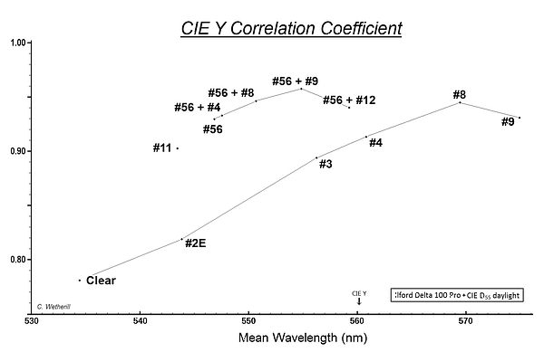
As can be seen, the #8 has a higher correlation coefficient than the #4, but once one is up above 0.90 the differences are minimal. The reason why one filter can have a better CIE y correlation coefficient but be further off in mean wavelength is a result of the spectral sensitivity curves not being symmetric.
The second interesting result is that most of the desired sky darkening effect is produced early on in the sequence, with rather modest yellow filters. This makes sense in retrospect because more of the sky's light is in the blue part of the spectrum. So one gets diminishing returns with stronger orange and red filters because there is less sky light to absorb once one is out in the orange and red parts of the spectrum. A #4 filter produces ½ stop (or Zone) of sky darkening relative to no filter (the #415), while it takes a solid orange #21 or #22 to get up to 1 stop above no filter, or double the effect; one of these is a tiny bit above 1.0, the other a tiny bit below. A #25 (A) red filter gives 1¼ stops, while to get to 1½ stops it takes a very deep red #92 -- with a nearly 5 stop filter factor (4.8), which is basically impractical for all intents and purposes.
The third thing to note is that it's easier to lighten blue skies than it is to darken them. Again, in retrospect this makes sense since there's more shortwave blue and violet light in a blue sky. Relative to a #4 filter one can only get about slightly less than one zone of darkening max, but almost two zones of lightening using deep violet filters (something that probably isn't done very often). Relative to no filter this is about ±1½ zones in either direction, for a total available range of adjustment of about 3 zones (or a little less).
Fourth, I'd also point out that this sequence of steps, achieved with a succession of stronger filters at the time of exposure, cannot be duplicated post-exposure with RGB frames from a digital camera treated in a "digital darkroom" to produce a monochrome image. For example, cranking down the B channel's contribution to the final output is not quite the same as going from, say, a #4 filter to a #12. It may have the same net darkening effect on a given blue sky, but other colors will react differently depending on their spectral compositions and the filter.
Finally, not shown in the figure is a Roscolux #10 filter, which the manufacturer designates as a "Medium Yellow" filter. It has a spectral transmission curve which is like a cross between a Wratten #3 and a Wratten #8 filter. The former has a moderately gentle slope from low to high transmission, whereas most UV-block and short wavelength blocking filters have a fairly steep cutoff between the two regimes. The Roscolux #10 is like the Wratten #3 in this regard, only at a slightly longer wavelength, meaning it absorbs more blue, moving it in the direction of a Wratten #8. In terms of its effect on blue skies, the Roscolux #10 plots only slightly differently (by 0.02) from a Wratten #4. It has a bit higher filter factor -- ½ stop versus 1/3rd stop for the #4, and the mean wavelength of its net passband with this film and white illuminant is only 0.4 nm higher than the Wratten #4. So its effect is indeed inbetween a Wratten #3 and a #8 -- and thus very much like a Wratten #4. I investigated it thinking it might be inbetween a #4 and a #8, but the calculations suggest otherwise.
It's worth reiterating that almost any amount of humidity, haze, fog, or dust in the air will make for a less saturated blue sky than I've used for these calculations and result in the filters having less darkening or lightening effect.
The photo at the top of the page suggested an interesting, simple experiment. This involved writing computer code to process the sky from the top of the picture down to the top of the highest peak, Vermillion Peak, at right.
For each line I first did a least squares fit of the pixel values as a function of x along the row. From high school math, the equation for a line is y = m⋅x + b where m is the line's slope and b its y-intercept. The result, y, would represent the pixel's value, not its y coordinates. The y-intercept is essentially the fit's value at x=0, the left edge of the picture. With this approach the entire row is reduced to just two numbers.
Because the sky darkens from left to right along each row, meaning the pixel values decrease, we expect these slopes (the m's) to be negative. The y-intercepts (the b's) give the expected pixel values along the left edge of the sky (x=0) based on the entire rest of that row. Due to noise and any non-linearity (curvature) in the run of values across the row, this will usually be different from the actual pixel value in the image at the x's = 0 by a small amount. (More on this later.)
Next, the slopes and y-intercepts were themselves least squares fit to lines, two of them, as a function of y, that is, from top (y=0) to bottom in the picture, reducing the entire sky area down to just four numbers. In math-ese, m(y) = mm⋅y + bm and b(y) = mb⋅y + bb, so the four quantities the program determines are mm, bm, mb, and bb.
This is pretty much the ultimate in image compression, taking megabytes and reducing them to 16 bytes.
Because the rate of left-to-right sky darkening is more or less the same across the sky, we expect the slope of the slopes (mm) to be a very small number near zero. Also, since the sky gets lighter as one goes from top to bottom, meaning the pixel values increase, we expect the slope of the fit to the y-intercepts (mb) to be positive. The y-intercept of the y-intercepts (bb) corresponds to the expected pixel value for the top-left-most pixel (at x,y=0,0) based on all the calculations.
From the four quantities the pixel value for any point in the sky (any x,y) can be calculated: first, y is plugged into the fits for both the slope and y-intercept, m(y) and b(y), yielding the equation for the line for that row; second, the pixel's x is plugged into this to yield the pixel value at that point along that row.
The four quantities essentially define a tilted plane representing the best fit to the entire sky area above the peaks. It can be extrapolated down the additional 30% distance to the lowest gap in the ridgeline, and then used to replace the original sky in the image with a perfectly flat version of it.
The process also has a couple of handy controls. For example, cranking bb down to a lower value darkens the entire sky. The key advantage here is that doing this with a stronger filter at the time the original exposure was made would also have darkened the shadow areas, since they are illuminated almost entirely by (blue) skylight, whereas turning bb down affects only the sky and leaves the shadows unchanged.
Another thing that can be done is to increase the contrast of just the sky in either the x or y directions, increasing the range in values between lighter and darker regions. Increasing mb increases the slope (range) in pixel values from top to bottom, while raising bm does this in the othogonal direction. The last of the four values that could be changed, mm, is generally not altered; doing so would lead to some sort of weird tilt in the rate of darkening/lightening, causing its axes to be skewed with respect to the x and y directions, giving a very unnatural effect. Maybe someone wants to do this for some reason.
There are two flies in this otherwise perfect ointment, as mentioned above: grain noise and non-linearity (curvature).
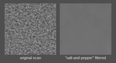
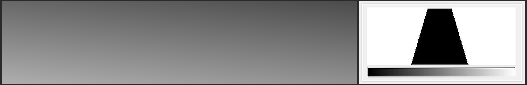
The first is most easily dealt with. In fact I had initially run my code on a version of the image in which the entire sky area had been treated with a "salt-and-pepper" (SAP) filter. This was not my own programming, so I'm not sure exactly what it does or how it works. It's in the suite of noise filtering algorithms in the program Paint Shop Pro 7.04 (JASC Software; Anniversary/Y2K Edition; 2000). It basically seems to find pairs of black and white specks of a certain size (or smaller) and replaces them with an average value. It's very slow but reduces any resulting mottling better than a median (or averaging) filter. Highly enlarged example at right shows a 1 mm square area before and after. Super-XX film was known to be on the grainy side.
For my B&W film scans at 2400 DPI, and a filter size setting of 7 or 9 pixels -- roughly 80 microns or a 1/12th mm -- this flattens out the pixel values to the point where the RMS error of the least squares fit versus the original data is less than 2½ for a typical row of pixels. The least squares "coefficient of determination" (usually called r2), which ranges from zero (bad) up to one (perfect), was running ~0.92 for the fit on the rows in the filtered image, which is pretty good. The remaining deviation from a straight line turns out to be due to curvature, not grain noise. When I ran the SAP filter on the original, un-filtered image sky, and then did the fit, the coefficient of determination dropped into the ¼ range, and the RMS of the fit versus the (noisy) data jumped by a factor of ~6x, to something like 14 pixel values.
The main cause of the deviation from a better fit is the data's curvature. The graph shows two line tracings and their fits:
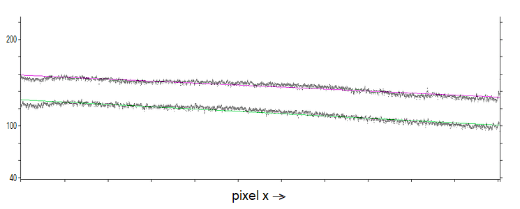
The top trace is the lighter (higher pixel values), and in fact is the last row before the sky runs behind the top of Vermillion Peak. The bottom trace is higher up in the middle of the sky, where it's a little darker. The vertical scale is such that the tick marks at left and right represent steps of 20 in the pixel values; these drop ~28-30 from the left end of the row to the right end. The non-linearity in both rows is obvious, with the data running above the fit in the middle of the lines and then falling below it at either end. Again, this is for the SAP filtered version, not the original, noisy data.
At the far left you can see in both sets of data a dip or darkening. This is due to developer processing uneven-ness, that being the edge of the film where the sheet is held during processing; it extends for ~300-400 pixels, which is ~1/7" (3½mm). I'm not sure why the same processing uneven-ness isn't easily visible at the other end of the row, because when looking at the picture it's actually more obvious on the right side than the left. This might have to do with the size scale of the uneven-ness; the one at left is broader, more spread out, so it's less eye-catching than the smaller artifacts on the right edge, where maybe they're more visible because they stand out more against the darker sky there.
The main cause of the curvature is likely the standard geometrical Cos4 lens off-axis light fall-off. This would be consistent with the curvature peaking near the middle of both rows, which are the points closest to the optical axis.
Correcting this is problematical because, for one thing, we don't in general know the location of the optical axis in the picture, the zero angle, though in this case it's likely in the stand of pines on the far side of the expanse of snow in the foreground, since I likely would have used a small amount of forward lens tilt.
But even if this is correct (or close enough) the magnitude of the adjustment one would want to make is difficult to determine. For a typical point in the sky, the distance from the optical center is ~5000 pixels, which translates at 2400 DPI into a distance a little more than 2", say 53 mm. For a 135mm lens, like the one used to take this picture, the angle to such a typical pixel is then ~21½°, so the Cos4 factor is ~¾, or 0.4 stops. In principle this dimunition in lens illumination away from the optical axis would get transformed through the film's characteristic curve to a lower density in the developed film, and then this would get transformed through the film scanner to some lower pixel value through the curve which describes how densities are converted into 8-bit pixel values. The magnitudes of these last two things are difficult to quantify without careful calibration of both, which we generally don't have (or don't want to bother doing).
In the absence of a good a priori way to correct the pixel values, the best approach would probably be to do it via trial-and-error, attempting to minimize the RMS error of the fit versus the data using some sort of adjustable "amount" scaling parameter. Fortunately, we don't have to go to the trouble, since affecting this correction wouldn't change the slope of the fit line substantively, due to the symmetry. It would change the y-intercepts, raising them (and the whole curves) several pixel values. We've already seen above that we can already do this simply by cranking the "bb" parameter up, lightening the entire sky area.
The next graph shows (in red) the run of the slopes of the individual rows from the top of the sky (left in the graph) to its bottom just above Vermillion Peak:
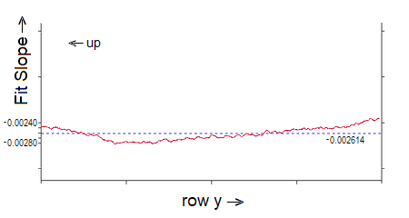
Recall that the slopes describe the rate at which the sky gets darker going from left to right across the picture, so they are negative, and we expect them to be roughly constant going from top to bottom. The slopes are very small, ~1/400, so the vertical scale here has been greatly exaggerated to show the variations. These are all the slopes of the scan lines like the two shown in the earlier graph.
The dashed blue line shows their average value. I cannot explain why the data first starts off declining, reaches a flat bottom, and then gradually rises the rest of the way down the sky, with a greater increase right at the end (the bottom). There is nothing special about the level at which the curve bottoms out and reverses, which is at an angle above what I take as the theoretical horizon of about 15° (±½°).
I have not done a least squares fit to the data because I suppose the result would not be very different from just using the average value (maybe slightly increasing from left to right), which is then taken to be bm in the equation above, with mm=0.
The other least squares fit parameter for each row, the y-intercept, is better behaved going down the sky. Recall that this is the fit for that row's pixel value at x=0, i.e., the lefthand edge of the picture. This increases from top to bottom as y increases (the sky gets lighter), so we expect the slope of the least squares fit to this parameter to be positive.
The graph shows the data with the (dashed) fit line to it:
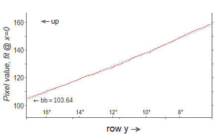
You can see that the fit is a good representation of the data. The latter is again curved slightly, so the fit runs a little above the data at its center and a little below it at both ends, since the curvature is more or less symmetrical.
[In this case the slight curvature in the graph of the data is easier to understand: If the probability of any nitrogen or oxygen molecule in the atmosphere scattering a photon of sunlight in the direction of the camera is the same, then the brightness at any point in the sky is proportional to the total number of molecules along the line of sight from the camera to the vacuum of outer space beyond the atmosphere.
In the flat earth approximation -- technically known as the "plane parallel atmosphere" approximation -- simple geometry tells us the number of molecules along the line of sight scales as the reciprocal of the cosine of the angle from the zenith of the point in the sky under consideration. This angle is commonly denoted by "z" in the field of astronomy, and the integrated amount of atmosphere from the surface to outer space is known as the "air mass". This is defined so the air mass is 1 at z=0, where the air mass is at a minimum, increasing as one goes away from the zenith (z increasing). In math-ese, a = 1 / cos z = sec z. In terms of the elevation (or altitude) of an object above the horizon, z = 90° - e. The elevation, in degrees, is shown along the x-axis in the above graph, with the 6° level being just to the right of the righthand y-axis.
"One air mass" is thus strictly speaking a local quantity, and varies from place to place with altitude, barometric pressure, etc., in terms of the total number of molecules directly overhead. Because the atmosphere dims light coming towards the surface from outside (by the scattering mentioned above), astronomers correct their measures of brightnesses to a=0, i.e., to above the atmosphere. This eliminates the local dependence of what constitutes a=1 so they can all agree on a brightness number.
The plane parallel approximation is good up to z ~80-85°, above which the sphericity of the earth (and atmosphere) needs to be taken into account and a more complicated equation for the air mass used, which actually lessens its value; the reciprocal of the cosine goes to infinity as z -> 90° in the plane parallel approximation, but in the real world there's always a finite amount of atmosphere along a path out.
The gist is that since the cosine function is non-linear we'd expect the run of sky brightness with elevation near the horizon to also be non-linear. We could calculate this, but, as before, since we don't know the film's characteristic curve (how the brightness would get translated into density on the developed film) or how the density would get translated into scanner pixel values, it's not possible to say how much curvature there should be.]
With the four variables determined the synthetic fit to the data sky can be generated, and it looks like this:
This sky has a range of 100 pixel values, from 75 to 174, inclusive. Its histogram (at right) looks rather unnatural, as one might expect.
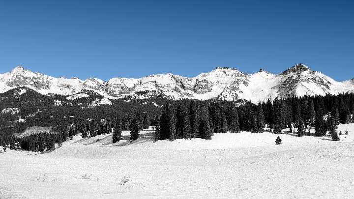
This SynthaSky™ can be pasted into and over the sky in the original and the result looks like this:
At computer resolution this looks little different from the original at the top of the page, but at higher resolutions it does give the slight impression of the mountains being in front of a sky "wall" behind them -- though I'm hardly an unbiased observer. It would probably look more real with a little fake grain noise added back in. This would require some alteration to my computer code, since as is I store no more that one scan line at a time, and such noise would have to be bigger than one pixel across.
One can play all sorts of other games with this sky, including converting it back into color:
It's notable how difficult it was to get both the hue and saturation levels to look "just right", as even a change of only couple of points in either seemed unsatisfying. The hue, to first order, is constant over an area of sky like this, but the saturation isn't so simple. The limitation of the Colorize function (in Paint Shop Pro 7, but probably common in picture processing programs generally) that added the color is that it gives every pixel the same hue and saturation.
By moving entirely into Hue/Saturation/Lightness (HSL) space in my own code all sorts of more subtle effects become possible. One that I've tried is to first make the hue of one of my sky pixels very slightly dependent on its lightness, in the sense that the hue shifts in the direction of becoming more purple-bluish ("colder", or higher numerically) as the pixel's lightness decreases. Second, the saturation can also be made to depend on a pixel's lightness, also increasing as the latter decreases.
When doing this, one of the things I found was that the lightness itself had to be increased a little (12 points) from its monochrome value (calculated from the four fit parameters) in order to yield a histogram that was centered on the same value as before (124½, see above) after the HSL values were converted into pixel R, G, and B values. The width of the resulting greyscale histogram increases, from 75 to 174 above, to 72 to 182. The histogram is no longer symmetrical, but is instead skewed very slightly towards the lower values, so the midpoint of the range is now ~3 points higher than the mean pixel value.
I think this lightness "deficit" is a result of the way lightness is defined in HSL space, as the average of the maximum and the minimum of the three RGB pixel values. In conversions from other tri-color spaces to some measure of visual luminosity akin to the eye's B&W response, one usually sees something like L = 0.3⋅R + 0.6⋅G + 0.1⋅B, and this is quite different from lightness, especially for bluer colors, which barely contribute to L/Luminosity but much to L/Lightness. An equation like this is the proper way to calculate greyscale from RGB, not something like (R+G+B)/3, much less the max-min midpoint. The low contribution of blue light to visual luminosity is why a blue-absorbing, yellow filter is used to correct panchromatic B&W films in the first place; we want the blues to record dark.
Another thing to notice is that the difference (or error, if you will) between Lightness and Luminosity is then going to be hue dependent. I'm not sure how lightness came to be defined this way, maybe it's because it's an easy calculation like this, but I think it's an inferior measure of what it implies it represents. The mathematical, geometrical way of saying this would be to say the L/Luminosity vector in HSL space is skewed at some angle from the L/Lightness axis, so it consists partially of some components from both H and S. L/Lightness is probably a much better measure on the yellow, green, and orange-red side of the color circle than on the opposite, blue-magenta side.
By going from monomchrome into 3-D space the number of different pixel values effectively triples, from 100 above to around 300. The latter number varies somewhat from one run of my code to the next due to the fact that I had to add some random noise (±½ pixel value) to both the hue and saturation values in order to prevent obvious banding, so I've seen the number of colors range ±3-4 around 300. (You can see such banding in the monochrome skies above if you look closely.) Adding in the random number generator function (twice) appreciably slows the code down, to where it can only calculate and output ~20 lines per second. So to do several thousand lines takes a couple of minutes. Eliminating the banding caused by the quantization of pixel values is also one of the rationales for adding back in some grain noise, since this breaks up or masks such banding, which is visible in a too-smooth expanse of sky.
The one small drawback of the increasing number of pixel values is that the generated sky image can't be losslessly reduced down from a 24-bit to an 8-bit image (with only 256 different color values available), which would make it considerably smaller storage-wise. At any rate, this all yields the following result:
This sky has a hue at the other end of the range of what looks "right". In isolation. When it is put next to the first sky hue, it looks distinctly "colder" (more purple-bluish) -- or the former looks slightly too greenish, depending. Alone each looks okay. The difference is ~3 points in hue, or a little more than 1%, based on the possible range in hue 360° around the color circle of 0-255.
I actually like this result a lot. By tweaking the hue I was also able to up the saturation without making it look exaggerated; it now ranges from 128 (lower left) up to 142 (upper right). At first glance the sky may look a little too light -- until you remember it should be light and luminous because it's lit both from above (by the sun) and by the extensive snowpack from below, which can almost double the amount of light bouncing around in the lower atmosphere. Yes, skies over snow covered landscapes are lighter than those over dark surfaces, even at high altitude. Our darkest high mountain skies here are probably in late October or early November, before there's any extensive snowpack. By January, even though the sun is lower in the skies, the sky can be brighter because of all the snow.
This works because a snow-covered landscape is largely monochromatic except for the blue sky. The dark pine trees may be a greenish or bluish-green hue, but they are so dark that they are little different from their hueless representations in a B&W photo. Similarly, some of the rocky areas poking through the snow up on the peaks may be a light brown or tannish hue, but their area as a proportion of the whole scene is so small that coloring them in would add little, so not doing so subtracts little. The eye of the mind can fill in these little missing aspects. The sky is the main thing, which is why the result here looks so different from the starting B&W photo.
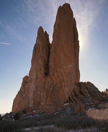
This work was motivated a lot by a picture I took of the Tower of Babel at the N end of the Garden of the Gods (Colorado). I got the picture composed and focused on the ground glass, and the necessary light meter readings made, and then turned around to figure out the exposure, set the shutter, and grab a film holder out of the camera case. With my back to the scene I didn't notice it was, during this short interval, being invaded by "sky worms" -- the obvious jet contrail at left in the main part of the sky, as well as two others in the lower right that are less visible at computer resolution. With the earth turning and the sun moving I suppose I was concerned about the latter starting to come out from behind the right edge of the vertical block of rock and wrecking the starburst-like effect up in the high thin clouds; the edge of the shadow I was in would have been not far away from me, and moving in my direction.
So I snapped off the exposure without turning around for a last check. I must have also broken down all my equipment without looking at the scene I'd just photographed, because I didn't discover the problem until getting the processed slide back, waaay too late to do anything about it -- like wait for the contrails to clear and then burn a second piece of film.
Thus I've been thinking about how best to seamlessly fix such flaws for a long time. The problem is that you can fit straight lines across such areas, perpendicular to their long axis, effectively bridging across them, except that the operation of doing the fit amounts to an averaging, and so the fill-in bridge across the gap you get does not have the same noise properties as the surrounding areas upon which it was based. The noise has been averaged away. In short, you replace the flaw with a dead spot which looks flat against the unaltered surrounding areas. Sure, an artifact is an improvement over the original flaw, but we have the information at hand to do better.
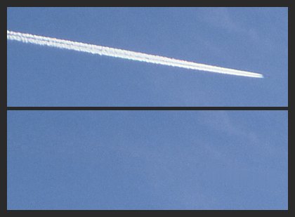
So the enlarged area of the contrail at right shows the result. Because the contrail is nearly horizontal, the least squares fit was done only in the vertical direction. The contrail itself is ~35 pixels high, so the fit was based on two zones, one above it and one below it, which were 25 pixels high. After calculating the fit I then computed the RMS error with respect to the fit in both fit zones. This value was used, along with the fit for each column itself, when generating the values which replaced those where the contrail was. While this is maybe not as good as trying to reproduce the granularity covering more than single pixels, it does prevent the contrail from being replaced by a dead zone which is nevertheless the correct hue, saturation, and brightness.
The same code was easily altered in a few positional and slope parameters to fix the other two contrails.
©2018-20, Chris Wetherill. All rights reserved. Display here does NOT constitute or imply permission to store, copy, republish, or redistribute my work in any manner for any purpose without prior permission.

Your support motivates me to add more diagrams and illustrations!
